Grey on grey is not a safe default. It is a deliberate choice that requires attention to undertone, finish, and scale. When done well, the result is layered, quiet, and refined. When done poorly, it reads flat and unintentional.
This guide covers the essential rules for combining grey marble and grey tile — so your space feels considered, not accidental.
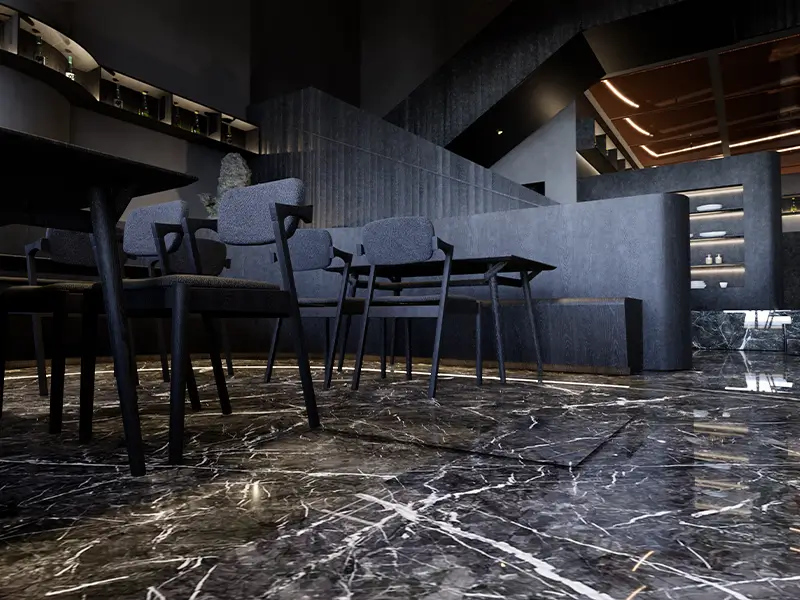
1. Match Undertones, Not Just Shades
Grey is never truly neutral. Most marbles and tiles lean either warm (beige, brown, yellow) or cool (blue, green, violet). Placing a warm grey next to a cool grey creates a subtle but persistent visual friction.
Always compare samples side by side in natural daylight and under artificial light before purchasing.
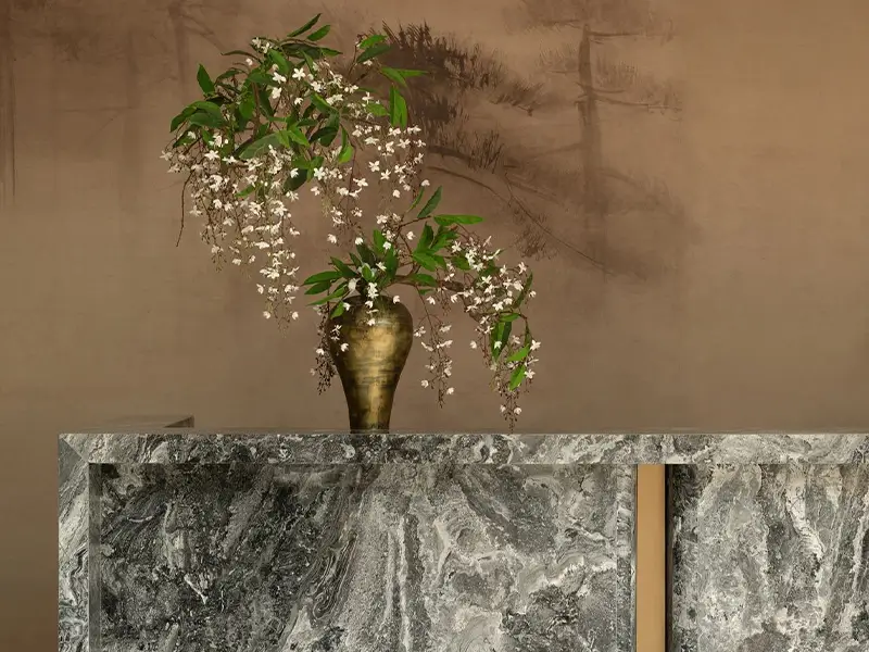
2. Differentiate Through Finish
When colour is similar, finish creates separation. This is the single most effective tool in a grey-on-grey palette.
| Marble Finish | Best Paired With |
| Polished (high-gloss) | Matte or lappato tile |
| Honed (matte, smooth) | Matte or lappato tile — flexible |
| Leathered / Brushed (textured) | Plain, untextured tile |
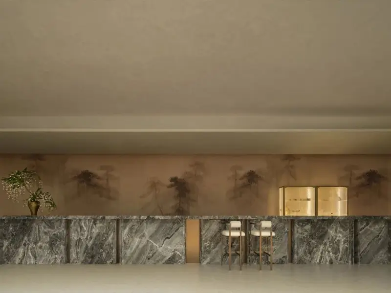
Avoid polished marble with glossy tile — both surfaces compete, and the tile usually looks cheaper by comparison.
3. Assign Clear Roles
Marble is a feature. Tile is a foundation. Not every surface needs to be marble.
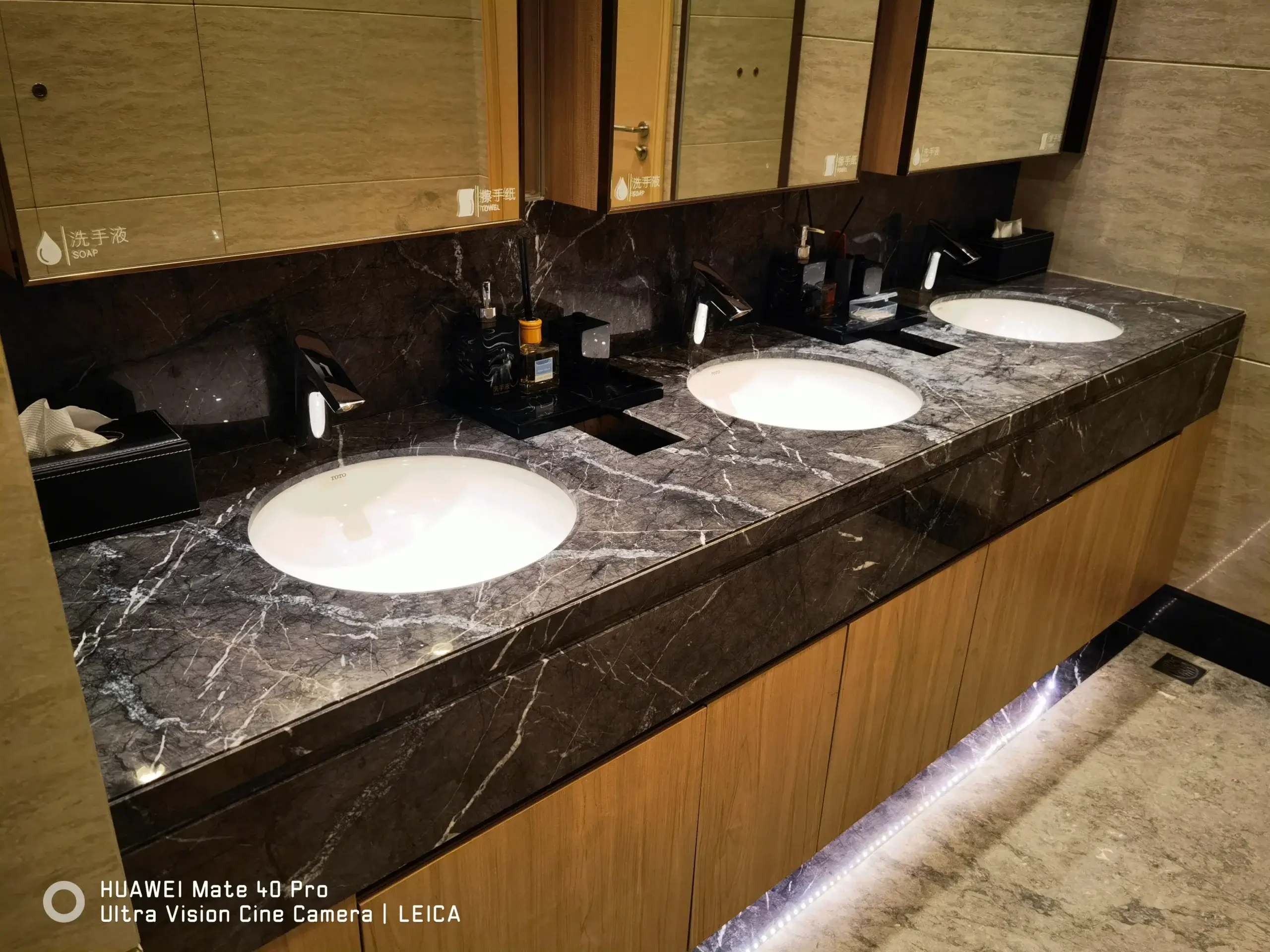
Use marble on: vanity splashbacks, kitchen range walls, shower niches, single feature walls.
Use tile on: floors, shower floors, hallway runs, large wall areas that serve as backdrops.
This division keeps the design interesting without overcrowding the space with stone.
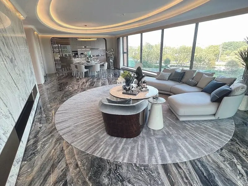
4. Balance Scale
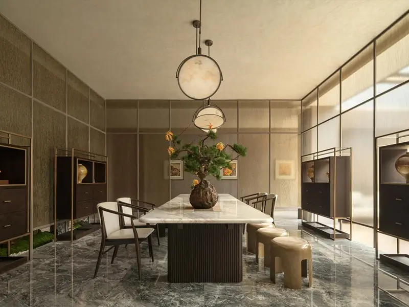
Large-format tile (60×120cm or larger) reads as a continuous plane. Pair it with either a full marble slab or a small-format marble element — not medium with medium.
Small tile (subway, hexagon, mosaic) benefits from a generous, sweeping marble surface nearby. The contrast in scale creates visual rhythm.
5. Grout Is the Third Grey
Grout colour determines whether marble and tile read as separate or unified.
Match tile → tile recedes, marble stands out.
Match marble → unified, monolithic feel.
Darker than both → bold, graphic effect — use intentionally.
Lighter than both → avoid — it fragments the surface.
6. Lighting Is the Fourth Material
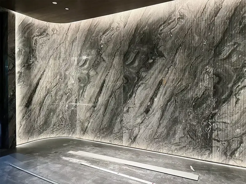
Grey changes under different light. Test your samples under the actual lighting conditions of the finished space.
Warm light (2700K–3000K) enhances warm greys.
Cool light (3500K–4000K) suits cool greys.
Do not mix colour temperatures in the same visual field.
7. Three Proven Combinations
Cool & Clean
Honed Carrara Grey + matte uniform grey tile + grout match tile
Best for: contemporary bathrooms
Warm & Layered |
Leathered Silver Shadow + terrazzo-look grey tile + grout match marble
Best for: entryways, powder rooms
Dramatic & Graphic
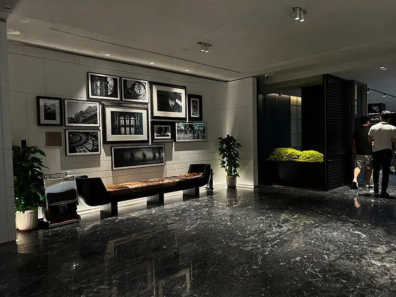
Polished Bardiglio + large-format solid dark grey tile + darker grout
Best for: open-plan living areas, lobbies
Conclusion
Combining grey marble with grey tile is not about playing safe — it is about playing smart. Match undertones, layer finishes, define roles, balance scale, choose grout with intention, and plan for light.
When all six elements align, the result is a space that feels cohesive, thoughtful, and quietly impressive — without a single colour competing for attention.
Need help selecting the right pairing for your project? Send us your floor plan and lighting conditions — we will reply with tailored recommendations within two working days.