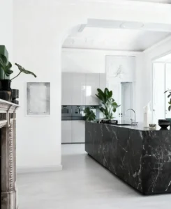
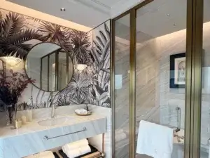
Not all beige is the same. Here’s what most people get wrong.
The “Beige” Trap: Why One Stone Can Look Completely Different
Walk into any stone yard and you’ll see dozens of slabs labeled “beige marble.” But here’s the reality: beige is not one color — it’s a family of colors ranging from creamy off-white to honey-gold to greyish greige .
The undertone of your marble — whether it leans warm, cool, or neutral — determines everything. Pair it wrong, and the stone can look muddy, washed out, or dated. Pair it right, and it becomes the most forgiving, luxurious backdrop you’ll ever work with .
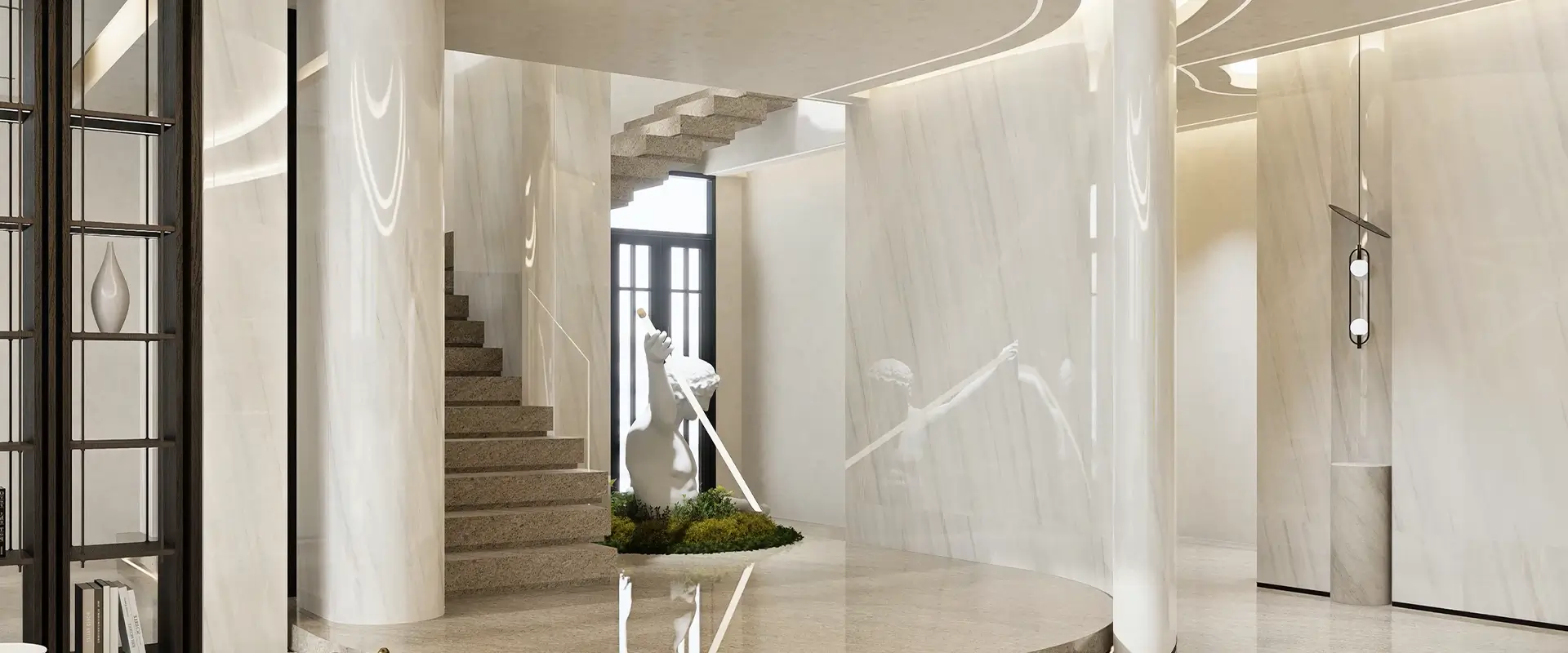
First, Read Your Stone: The 3 Undertones
Before you pick a single paint color or fabric, identify which “beige” you’re working with. This one step saves you from costly mistakes .
Warm Beige (Honey / Sand)
What it looks like: Soft golden or caramel warmth.
Looks best with: Warm woods (walnut, oak), brass and bronze, terracotta, olive green, cream tones.
Warning: Too much yellow lighting on warm beige can lean “orangey.” Balance it with neutral or warm-white light sources .
Neutral Cream Beige
What it looks like: The Goldilocks option — not too yellow, not too grey.
Looks best with: Almost anything. White, off-white, light woods, black accents.
Best for: Apartments, rental properties, or spaces where decor changes frequently. This is the safe, timeless choice .
Greige Beige (Grey + Beige)
What it looks like: Cooler, more urban, slightly greyish.
Looks best with: Black fixtures, charcoal, ink blue, dark green, glass, steel.
Warning: If your cabinets or doors are very warm-toned wood, a heavily greige marble might clash. Test samples together first .
Patterns Matter as Much as Color
Once you’ve nailed the tone, look at the stone’s pattern personality. This affects which colors and furniture styles will work alongside it .
| Pattern Type | Best Use | Styling Rule |
| Soft Cloudy | Large floors, full walls | Keeps the space calm — let furniture do the talking / 保 |
| Fine Speckled | Kitchens, bathrooms, high-traffic zones | Hides daily marks well — pairs with simple, solid-colored furnishings |
| Strong Veining | Feature walls, islands, fireplaces | Use sparingly. Surround with quiet, muted finishes so the stone remains the hero |
Ready-to-Use Color Palettes
Palette 1: Monochrome Quiet
Best for: Bedrooms, spa-style bathrooms.
Stone: Neutral cream beige, low-pattern.
Pair with: Off-white walls, taupe or pale beige furniture, curtains in a similar tone but different texture .
Result: Soft, cohesive, and deeply calming.
Palette 2: Earthy & Cozy
Best for: Living rooms, family homes, villas.
Stone: Warm honey beige, medium veining.
Pair with: Cream walls, medium-to-dark wood furniture, olive or rust cushions and accessories .
Result: Warm, inviting, and timeless — the kind of space people don’t want to leave.
Palette 3: High-Contrast Modern
Best for: City apartments, offices, contemporary lofts.
Stone: Greige beige, honed finish (matte).
Pair with: Crisp white or very light grey walls, black doors or black-framed partitions, minimal furniture, simple lines .
Result: Clean, sharp, and designer-looking.
Palette 4: Soft Color Pop /
Best for: Bedrooms, powder rooms, spaces that need personality.
Stone: Neutral beige or warm cream.
Pair with: Warm white walls, furniture in soft grey or sand, accent colors like dusty pink, sage green, or muted blue .
Result: Calm, with just enough personality to feel personal.
Materials That Work (and One That Doesn’t)
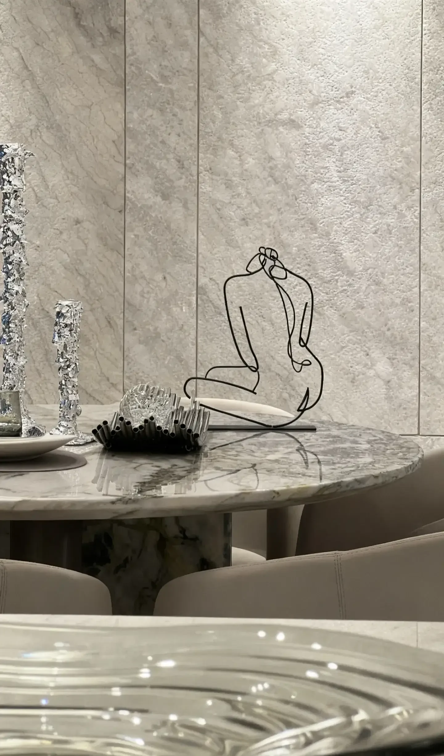
Beyond color, the material you pair with beige marble affects the overall feel .
| Material | Effect | Best Matched With |
| Light woods (oak, ash) | Airy, Scandinavian/Japandi vibe | Neutral cream beige |
| Dark woods (walnut, wenge) | Rich, classic, more formal | Warm beige |
| Black / Gunmetal | Modern, structured, minimalist | Greige beige |
| Chrome / Stainless | Clean, cooler, understated | Greige or neutral beige |
What to Avoid
Beige marble + too much cool grey without any warm material can create a muddy, flat effect — neither warm nor cool, just dull. Always anchor it with wood, brass, or another warm element .
Final Thought
Beige marble is not a blank slate. It has character — warmth, coolness, movement, pattern. The secret to getting it right isn’t memorizing a color wheel. It’s reading your stone first, then building the room around it.
Three steps to get it right every time:
Identify the undertone (warm / neutral / greige)
Match the material palette to that undertone
Let the stone’s pattern dictate how busy the rest of the room should be
Do these three things, and your beige marble project will look polished, intentional, and timeless — not because you followed a trend, but because you understood the material.
Have a specific beige marble slab in mind? Bring a photo to our showroom and we’ll walk you through your color options — in person, with real samples.